“Make it simple, but significant.” – Don Draper, from Mad Men
The case for design principles
The interlinking of form and function are universally accepted design concepts that were first formalized at the Bauhaus, in a style now known as the International Style. But design has existed since the dawn of humankind. In the digital age, the design process and the way we work with the elements and the tools we use have changed, but it has not changed the design principles themselves.
To live in a digital world has come to be synonymous with having a design for it. Not just being a plan for the construction of a process or interaction, a design now has to have both form and function – the value designers bring to their clients is the thinking and the ability to combine and translate those thoughts into seen and unseen results.
Roman architect, Marcus Vitruvius Pollio, in his “De Architectura” (English: On Architecture), a good building should satisfy three principles: firmitas (the durability of a building); utilitas, (the suitability for the purpose it is built for); and venustas, (the aesthetic value of the building).
Source
What is good design?
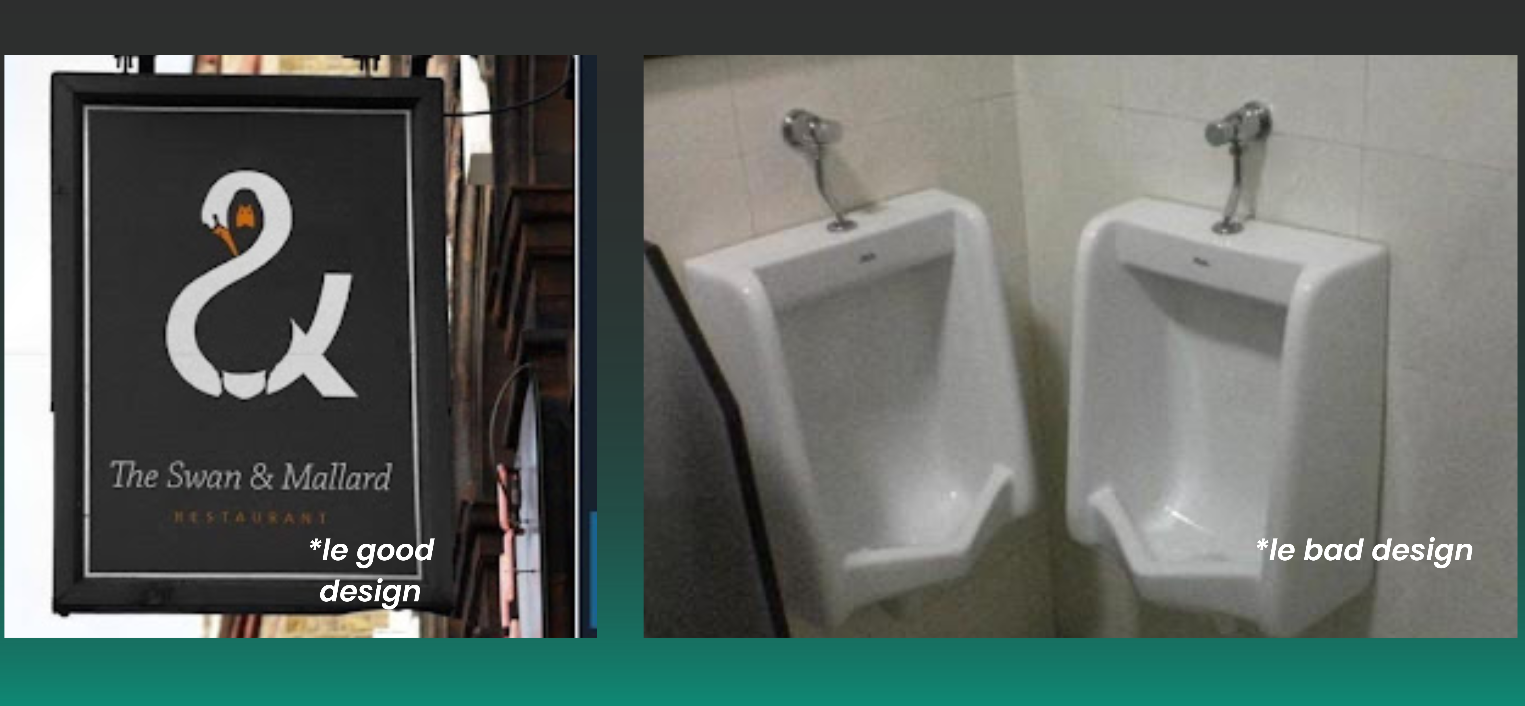
Good Design vs. DesignOops
Good design tells a story or gives you a plan for one. Visual design, like an ad billboard, an app, or an icon, are all just compositions of basic shapes to make something greater. How a person moves through visual information depends on the layout. You could encourage someone to move through a building with navigational signs, or more subtle elements of interior design and architecture that draw them in on their own.
How come pen caps have a hole on top? It allows one to close the pen without facing any air pressure and prevents suffocation if swallowed. Because people have been chewing on pen caps forever. So here, the addition of a small hole not only serves to improve functionality but also plays a larger role in safety.
Examples of good design
- Gmail’s undo button after you’ve sent an email.
- Encouraging first-party data in a cookieless future. More privacy-positive, personal, intuitive campaigns.
- Spotify unwrapped. There were 62M downloads by the end of 2022.
Examples of DesignOops
- Blockbuster’s failure to innovate with the changing times. Long live OTT.
- Letting Google search dictate your ad strategy. You’re wasting money.
- BeReal’s 1.2M weekly downloads in August 2022. But it saw a 95% decline since. Shit is hard in consumer app retention.
In a utopian scenario, your design should have balanced components
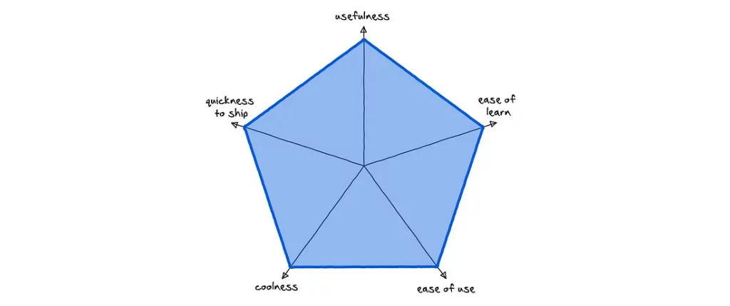
The principles of design
To paraphrase Alex White, author of The Elements of Graphic Design, when all elements in the design are in agreement, a design is considered unified – no one part of the design is more important than the whole design. Let’s unpack the principles of design that contribute to visual unity.
Design principles are working mechanisms of concepts that designers use to achieve what could be good design. The fundamental principles of design are – Emphasis, Balance and Alignment, Contrast, Repetition, Proportion, Movement, and White Space.
Design Principle #1: Emphasis
Emphasis refers to the focus of a design, something that highlights the order of importance of the elements in a design. Say you’re creating a website. You would ask yourself: what is the first piece of information people visiting the site would need to know? The name, probably, then could lead to options where the audience could then learn the who, what, and how of the website and those behind it.
Emphasis could be created by using different colors, textures, shapes, and fonts (not an overwhelming amount though).
Pro tip: Nothing helps plan out what a layout could look like better than a good ol’ physical sketch or writing a website copy down. Like building without a blueprint, if you start off without a proper idea of what you’re trying to show, your design is more likely to be confusing.
Design Principle #2: Balance and equilibrium
Emphasis can be varied based on the balance and equilibrium you want to give to each element. Every element you place in a design has a ‘weight’ to it. This can come from the color, size, or texture you end up using for it. For example, on a black background, a purple and yellow box element would stand out very differently, but wouldn’t necessarily go together on the page individually. However, they could work together as text layered over each other to make it pop. Without balance and equilibrium, the audience could feel scattered and confused by the design.

Additionally, on the page overall, a symmetrical or asymmetrical design could be used to arrange elements around a central line equally or in opposite weights respectively to create a larger picture that is not even but still has equilibrium.
Design Principle #3: Contrast
Speaking about elements ‘popping,’ contrast is what people usually mean when they say a design practically stands out – it literally comes away from the page. While contrast can help create emphasis, all emphasis doesn’t need to be created through contrast. Contrast creates differences between elements in the design.
Design Principle #4: Repetition
Now keeping in mind all these things – having to achieve unity in design, and have the important thing emphasized, while also maintaining the balance, there is bound to be some repetitions, and that’s alright! Repetition often unifies and strengthens a design. For example, if only one set of text on the design poster is in a small red font, it can read like an error. If three things are, you’ve created a motif.
Design Principle #5: Proportion
Proportion is also an important feature of design—think of a box at the bottom of a poster for ticket information. Proportion can be achieved only if all elements of the design are well-sized, with the important stuff bigger than the rest. Once you figure out emphasis, balance, and contrast, proportion should come to you on its own.
Design Principle #6: Movement
In the digital space, movement, both static and actual movement, helps control the elements in a design in such a way that a person’s focus is led to move from one to the next with the information being communicated in a certain order. The Z-movement and F-movement are known to be the popular ways in which a person generally absorbs information on a text-heavy page, but this changes when it’s about more graphics and other elements. You have a lot of control over where people look when they’re viewing a webpage or a poster or some such thing. On a text-heavy and graphic-light page, a visitor’s eye likely follows something like a Z-pattern or F-pattern across and down the page.
Design Principle #7: White space
Sometimes, good design is a ‘lack’ of it as well. White space—also called “negative space”— are areas of a design that does not include any design elements. White space serves many purposes, first that it gives the elements some room to breathe. Secondly, it can also help highlight specific content or specific parts of a design. The ever-popular example is the FedEx symbol, where there’s an arrow in the word. Were the ‘e’ and ‘x’ placed further apart as actual words, this wouldn’t have worked.
Good example of movement across the page – starting from the negative space for the header, then green drawing you it, the balance at the bottom with the text and picture, then back up to figure out how to navigate further.
The Psychology of Design: Gestalt’s Principles
Aside from a hierarchy of sorts involved in conveying information, there is also a set of pattern-thinking principles that aid design. The Gestalt principles, or the principles of grouping, are a psychological understanding of how we as humans interpret visual information and the elements that affect those perceptions.
Our minds identify patterns in what we see (one great example of this is on the Reddit subreddit r/Pareidolia.).

Psychologists group people’s perceptions into five main categories: Proximity, Similarity, Continuity, Closure, and Connectedness.
Proximity
The grouping of elements near each other. When objects are close to one another, people end up grouping them together, creating a relation of sorts. On the other hand, you could use more white space to separate objects.
Similarity
The grouping of elements based on something they have in common, like color, shape, or size.
Continuity
The repetition of a pattern or element, with or without new inputs into the design.
Closure
A pattern with an incomplete object, which implies the pattern continues outside a composition.
Connectedness
When elements are in contact either directly or indirectly through other elements, like a line or such.
Additionally, and also another part of the Gestalt principles, past experience aids in making a seamless experience. If one page of the website feels dissimilar from the next, one could assume that they’ve reached a different site altogether.
How do you make it all work though
While this is all a lot of information to digest and putting it all together can take a toll, there are a few ways to help coax the process along.
1. A digital detox
Nearly all of us spend our time glued to the computer screen either for work, entertainment, or even to gain inspiration itself (shoutout to Pinterest). In the digital age, we even create most of our work digitally. But sometimes, all you need is to unplug and get the creative juices flowing, no matter what you’re trying to take a decision on. It also helps to just look at other forms of art while designing anything, like a different genre of a movie, walking around a museum, or even just looking at kids’ doodles! When the work is different from what you’re used to, immersing yourself in something new can generate tons of new ideas.
2. Remember that you can’t force creativity
If nothing seems to be working, don’t force it. Losing steam is normal, and it’s okay to see a blank wall in your head when you’re out of ideas or inspiration. Something as simple as a walk could help. However, as creative heads and decision-makers, you can’t afford to sit around and wait for inspiration to strike. It then helps to just show up to work consistently. By sticking with a task and looking at it from different angles over the course of a period, you could potentially do something to generate new work, and creativity would come along for the ride. Also, if there’s one thing that can get your brain and imagination pumping, it’s a hard deadline.
3. Break it down into manageable chunks
Often, a project just seems big enough to lose track of the bigger picture. Here it helps to break down the tasks into smaller and more manageable chunks. One by one, the bigger picture would come together, and you could tweak each part as you go along.
Also read How the design team at CRED is pushing boundaries.
Closing thoughts
Developing an eye for the visuals starts with finding these basic design principles and putting them through all sorts of trials and tribulations in your work. What makes your customer engage with a piece of content? What elements draw their interest and what makes them mad?
Remember: be creative – at the end of the day, design is about user research and experimentation from the user’s POV to create a fulfilling experience.