User research aims to answer the question, “do people want what you’re selling?” It includes the work of UX designers and user researchers. It attempts to learn as much as possible about users of a particular product. What they like and don’t like, what changes are necessary, and how to fix what’s not working.
Humans wanted to move heavy objects, so we got wheels and pulleys, developed all the way until now. We have factories that make machines that tower over us. And things that are more personal to us like smartwatches and uncomplicated peanut butter jars. Making products better, more intuitive, and expanding capabilities is iterative. Staying competitive means continually experimenting with what works and what doesn’t, and how to make it all cost-effective.
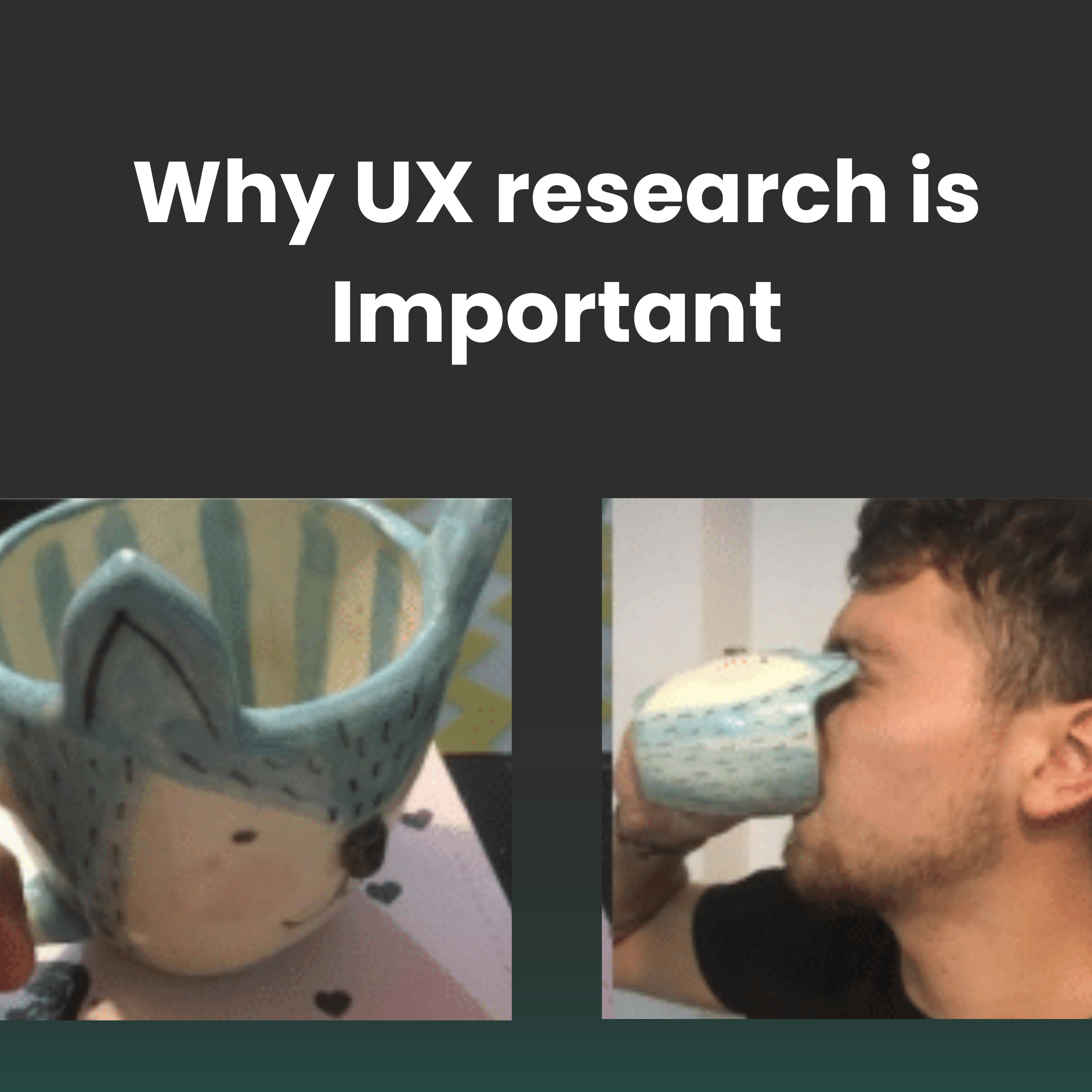
Good user research requires good practice. The number one rule is coming to it with a beginner’s mind. It requires you to approach each step without pre-decided ideas. Any controlled experiments make research vulnerable to bias.
Importantly, user research helps you understand your product’s return on investment (ROI). Development can start when all the stakeholders sign off on the research. You outline effective methods, changes, and other research elements key to the product development process.
The 5 Stages of User Research
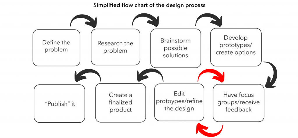
- Objectives: These are the questions you’d be trying to answer and what you’re doing the user research for. What do we need to change? What are the knowledge gaps that need to be filled?
- Hypotheses: These are baseline assumptions. What do you already know about the users, in terms of their behaviors, and what could be the potential solutions to their needs?
- Methods: Here you’d be picking what kinds of methods you’d use. Additionally, you’d also decide what people to test your hypotheses on.
- Conduct: This would involve collecting the data through the methods that had been picked. It could also involve multiple tests and multiple iterations.
- Synthesize: In the final step, we should ideally have an answer to our research questions, and have either proven or disproven the hypotheses. Collating the data could also give rise to further suggestions and ideas to implement in the product.
Dimensions of user research
The Attitudinal vs. Behavioral Dimension
The difference between the two is “what people say” vs. “what people do.”
Attitudinal research tries to understand people’s stated beliefs. It is subject to what people are aware of and are willing to talk about. For example, surveys measure attitudes that can help discover important issues that respondents are open about.
Behavioral studies try to simply understand why people do what they do with the product. For example, A/B testing presents changes to a site’s design to random samples of visitors. It also attempts other things constantly to see the effect of different website design choices on behavior.
The Qualitative vs. Quantitative Dimension
Qualitative methods produce data about behaviors or attitudes from surveys, interviews, and focus groups. While in quantitative studies, data is measureable. In the former, researchers directly observe or ask questions about how people use or interact with the product. Quantitative information could include tracking task time, whether a user has followed a certain path, etc. The insights are derived from mathematical analysis.
Types of user research
Here’s a short description of 10 user research methods:
Usability testing:
One-on-one tests where users are given mock scenarios that lead to tasks and usage of specific interests within a product or service.
Field studies:
Observations of potential users in their own environment without interuptions, where the product would be used in its most natural environment.
Focus groups:
Groups of 3–12 are led through a discussion about a set of topics with feedback loops and exercises.
Interviews:
One-on-one discussions with users.
Eyetracking:
Eye-tracking devices measure where users look as they interact with products, thereby finding the easiest and quick way around the product.
Usability benchmarking:
You can run scripted usability studies with larger numbers of participants, with precise and predetermined measures of performance. Usually, thistracks improvements of a product over time or comparing it with competitors.
Concept testing:
An idea that you float to potential users before development to determine if it meets their needs.
Customer feedback:
Open-ended and/or close-ended information is provided by a self-selected sample of users, often through a feedback link, button, form, or email.
Desirability studies:
Participants are offered different visual-design alternatives and are expected to associate each alternative with a set of attributes selected from a closed list. These studies can be both qualitative and quantitative.
A/B testing:
A way to test different designs by randomly assigning groups of users to interact with each of the different designs and measuring the effect of these assignments on user behavior.
Surveys:
A measure of attitudes through a series of questions, typically more closed-ended than open-ended.
Doing good user research
Separating UX into two separate research and design roles affects the overall design experience. This can lead to warped development that don’t consider the two each step of the way.
Stereotypes pit designers as innovators who aren’t necessarily sticklers for evaluation methods. While researchers apply rigorous scientific evidence of to design decisions. Supposedly at the cost of design decisions.
On account of this, there’s a high chance of fragmented data. One team could rely on behavioral data (like shopping cart conversions) to fix a problem. But it may attempt to do this without asking the design team, who could have an answer to this.
Consciously exploring and addressing the following themes can help both researchers and designers solve the problems while being in step with each other.
Using a variety of user research methods
Pick out the most comfortable research tool. Avoid internal selection biases that can leave you with an incomplete view of your customers and their world. That’s risky: you’ll miss finding interesting patterns that emerge from different research silos.
One of the most useful maps is Christian Rohrer’s “Landscape of User Research Methods.” It depicts research methods within four quadrants by two axes. Qualitative versus quantitative, and attitudinal (what people say) versus behavioral (what they do).
Keeping up the practice of research
User research, like most things, doesn’t work well if it happens only once in a while. Your users’ reality is constantly in flux, along with the world around us. Setting a good and regular cadence is important, irrespective of how big the iterations are.
To establish this, you must prioritize the organization’s research methods by effort and cost. Take note of gaps in timing. If research is coming in on only an annual basis, look for opportunities to gather new data maybe quarterly.
Get talking
If most of your team are engineers, while you’re a designer, cross-pollinate across functions. Share research data, new projects, and customer-facing design work across teams for novel, holistic solutions.
Make space
Trying to make your product more inclusive is never a bad idea. Additionally, visual and keyboard adaptations, voice interfaces translation technology, etc. inclusive design can globalize your product. People who can’t travel or interact easily in the physical world require more virtual access. The user experience dictates the success of the tech used to offer a solution.
The bow on top
No matter how and what you plan, users could possibly do something different that you might not have expected. Besides, these ‘desire paths’ occur everywhere. In either case, meticulously search for them and optimize for the user. Regardless, these paths work better for people.
A good example of this is the 140, and now 280, character count. Users found a way to work around the contrived limit and started threads. With the boom user of newsletters post-pandemic, Twitter now also has started its own subscription service.
In conclusion, design is best when it is iterative and evolutionary. And, it’s through good research that that happens. Keeping a healthy working balance between the two is the best way to make a successful product.


