Ask around for the sleekest app, and the most popular answer would be CRED — the members-only platform that provides rewards in the form of coupons or discounts for paying credit card bills through the app. But what sets CRED apart?
It’s not just aesthetics. A good app has deft transitions, but above all is functional, and remains so despite heavy user traffic. The Design team at CRED agrees. In their design manifesto, the team stated:
“For us, being fast is beautiful. bringing joy at every step is beautiful. Creating something that works every single time, time over time, is beautiful… Making something that functions like how you’d like it to or even better, is beautiful.”
Operates like a rock band
CRED consistently iterates its design. Since its launch in 2018, it has been through four different versions — nearly one overhaul every year. It’s clear that the Design team never rests on its laurels. After all, being led by a literal rockstar — Harish Sivaramakrishnan, lead singer of the Carnatic rock band Agam — must be a boost like no other.
Sivaramakrishnan isn’t new to Design. He completed his engineering from BITS Pilani. Having previously led teams at Adobe, Myntra, Freecharge, Snapdeal, and Google (!), he landed at CRED’s shores when the company had just released its first version of the app. With nearly 200 employees under him, Sivaramakrishnan leads a strong, talented bunch under him.
The results are for everyone to see, especially for the 9 million+ registered users it currently boasts on its platform.
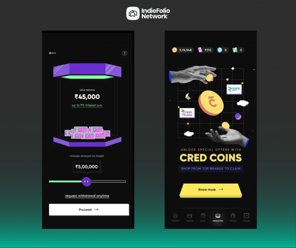
CRED’s latest design version, released earlier in 2022, is called NeoPOP. Inspired by the art movement of the same name, NeoPOP involves turning everyday objects — coffee mugs, chess pawns — into the central focus of the topic.
In their own words, CRED describes NeoPOP as a “sophisticated, future aware, backward compatible library that is built to ensure that every feature, every little piece of design can be created to look just like it did on a designer’s screen. NeoPOP makes our app look great, and work great. it also makes it incredibly fast, effective, and easy to build on top of.”
This ethos is implemented throughout the app. Even the onboarding and sign-up screen — a much neglected but important part of any app — completely imbibes CRED’s design philosophy.
Key Principles
Using bold and colorful imagery, CRED used three key principles while designing the newest design version of their app:
– Isometrics: Drawing three-dimensional objects in two-dimensional planes
– Linear motion: Illustrating an object moving from one point to another in a straight line or fixed axis
– Pseudo-morphism: Literally means “false form”; uses objects that transform into fluid displays
On the engineering front, CRED had the following goals in mind:
– Easy to use and beautifully designed React components based on the NeoPOP design system
– Flexible and composable components which accept custom configurations
– Commonly used utility methods and functions
– Fluid and highly optimized animations
A lot of late nights for CRED’s engineering team, for sure. But the end results spoke for themselves: extensible, API backward compatible, and highly measurable framework. Any future iterations and experiments will be easy to test, and much easier to execute with such fundamentals.
Keeping these challenges in mind, CRED worked on its fourth overhaul in five years. To that end, it even introduced a new font: Cirka, since fonts are typically the most noticeable change on any website. In sharp contrast to modern design thinking, Cirka is a serif font and is used for all headings and titles on the app. That alone gives it a retro feel, which merges well with the NeoPOP theme. For the rest, CRED uses sans serif fonts: Gilroy and Overpass Mono.
It stuck to a largely monochromatic layout: a black background with white cards. Banners and marketing campaigns were filled with neon colors that contrast sharply with monochrome. The entire Design thinking, and especially the execution, integrates flawlessly. This experience heightens on the rewards page: with multiple bold colors popping off, it’s an exciting and fun page that highlights all the discounts the user has won.
The entire Design system has only boxes; no curves — again an intentional contrast to modern design thinking. You’ll only find right-angled edges throughout the app.
“For us, design should inspire creativity, design should bring out emotions, design should delight, design should seek a purpose beyond the most obvious and most importantly, design should touch humans in ways beyond our collective imagination,” the manifesto states. And it shows!
Safe to say, the results paid off:
If you’re impressed by this, it’s easy to implement too. CRED believes in democratizing its work. “we at CRED believe in sharing our work and our learnings for the benefit of the larger community. in that spirit, we open source the NeoPOP library, for the community to leverage and enhance,” said a blog post
It has open-sourced its entire framework on Github: https://github.com/CRED-CLUB/neopop-web.
CRED’s design team added: “We encourage developers around the world to use this framework to build on and push the boundaries of what we started.”
A noble and respectable notion, indeed.
Building Blocks
CRED’s Design team also had three other versions to speak of. Let’s take a brief look at them:
The first iteration was Topaz. Perhaps the most pivotal design version — after all, the entire app did debut using this version — Topaz was built on the principles of flat and reductionist minimalism. Moreover, the typography was overtly simple and filled with sans-serif fonts. The main intention was to highlight the high-performance payments system that CRED had engineered; aesthetics, unfortunately, came a close second. Numbers were the key focus in this design version; CRED’s team didn’t want to overload the screen with text. It also had fewer tie-ups and partnerships to speak of.
Little known fact: at the same time, CRED also launched Cyborg, a 90s sci-fi-themed illustrative and motion library. It contained a slew of sophisticated yet functional Lottie-based animations, marking a completely new way how motion design to be used in mobile apps.
Topaz was specifically created for credit card payments and CRED’s own payments gateway. However, as the user base grew, so did the requirements of the app. The CRED app we know today is vastly different from the one that launched in 2018 — so why should the design thinking?
A year later came Fabrik. This version retained the key design philosophy that CRED became famous for. In many ways, the new Fabrik was a continuation of Topaz, but with special attention paid to the cards on the app. Using skeuomorphic card designs, Fabrik focused on creating a mosaic of reward cards — after all, these tie-ups were the main focus of the app and an important revenue source for the company at large.
However, CRED soon realized that a more sophisticated system would be needed. While the user-facing frontend worked as intended, the back end suffered a myriad of problems. Their team couldn’t keep up, and there were too many fires to put out.
For its next iteration, the design system was spearheaded completely by the backend team. Christened Copper, was the first ever fully customizable. CRED moved away from its erstwhile reductionist approach; visual elements were the most striking part of this redesign. With Copper, CRED could successfully ship out newer features from the center, rather than needing to overhaul the entire setup.
Copper was a visual treat, but suffered some issues with functionality. Due to strong fundamentals and a backend team that was determined to iterate more and iterate better, we now see NeoPOP, which set an industry standard for UX design in apps. Hats off to CRED’s Design team, which is no doubt an inspiration for every app currently being tinkered with.